 If you type 'CV tips' into google, the search result shows a whopping 1,510,000,000 sources...That's ALOT of information for one person to sift through, and with job deadlines looming, you might need something quick and fast to get you on your way. I sat down with two recruitment specialists to bust some CV myths, find out what really helps you stand out to recruiters, and some common mistakes to avoid. First, I spoke to Charlie Waterman, who has spent the past 6 years in recruitment and now heads up Talent Acquisition at a company called Harnham (wow, go Charlie!). Charlie now focuses on recruiting for Harnham's graduate scheme, and she's also previously recruited for big companies like British Airways, Deloitte and even Facebook as well smaller start ups- so you can be pretty sure she knows what she's talking about! So Charlie, is it true that some recruiters only look at your CV for a couple of seconds? If so, how can you make your CV stand out against others?It is true that recruiters take a very short amount of time to look at a CV. In my experience, speaking for me, having recruited for 6 years I am a master skim-reader and I know what I am looking for when reading a CV. I'll typically spend around 5-10 seconds doing that initial skim-read and then if I am interested naturally will spend more time reading and then wanting to talk to the candidate to find out more.
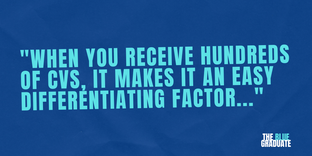
To stand out, it's quite simple: 1. Make sure that you're flagging to the person reading that you want to do the role that they are recruiting for. So if it's a Media Buyer, have the words media buyer in your personal summary at the top. You would be surprised at just how many CVs have another job listed in the personal summary or a very vague overview - when you receive hundreds of CVs, it makes it an easy differentiating factor. 2. For graduate roles, put your education up top. But make sure you still have a work experience section with a clear outline of your work and commercial experience. You may not have done an internship or have relevant commercial skills, but any work experience (even if it seems irrelevant) is better than none. Working in a coffee shop will have taught you many skills that a company will benefit from, hiring managers just like to see that a graduate has had to put a bit of hard work in before - no matter where that may be. 3. Network - see someone that works at the company you want to work at that went to your school or uni? Use it - introduce yourself and ask them if they'd be open to jumping on a call to network and find out about how they got there. Flatter them a little and don't be too pushy at asking about the job you've applied or want to apply for - chances are if you do it right, they'll not only give you some helpful advice but they'll probably also put in a good word 😉 Join us for part 2 next week where we speak to Julie Grimes, founder of Jaguar White Recruitment, who shares three of the biggest mistakes someone can make on a CV and how you can avoid them!
0 Comments
So you've decided to take on the challenge of designing your own creative CV to stand out from the competition and showcase your skills, but where do you start and how do you ensure that the design looks professional? You don't have to have graphic design skills to create a smart, professional looking document, just follow these 7 simple steps: 1. ColourColours can be used to relay meaning, express ideas and provoke emotion, such as when text is presented in red to show that it is important or alerting you to danger. If you are designing a CV specific to the organisation you are applying to, use its brand colours. However, if you are creating a more generalised CV to send to multiple organisations, use a colour that represents your personality (you should do some research on your chosen colour to understand what meanings are conveyed). 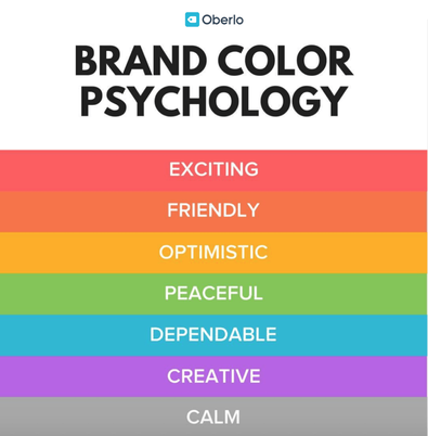 Image sourced from: https://www.oberlo.com/blog/color-psychology-color-meanings 2. HeadingsWhen using headings, always make sure that they are all written in the same font and size. You can change the colour or font style to help them stand out even more, which is a great way of guiding the reader through the document, dividing sections and maintaining a consistent format. 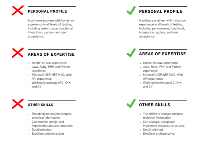 3. DatesWhen presenting your work experience or job history, make sure that dates are easy to follow by writing them in the same format. Avoid 'January - December 2017 - 2018' and instead go for 'January 2017 - December 2018'. 4. SpacingIf you are leaving small spaces between paragraphs to divide sections, make sure that the amount of space between each section is the same. This makes your work look more aesthetically pleasing and coherent, meaning that people will be more likely to want to read it (typical human behaviour as we are attracted to things that look good). You should also avoid leaving a lot of blank space as it can be disengaging and make your design look unprofessional, leaving content to be desired. If you have large amounts of space on your CV once you have finished designing it, trying moving sections around or adding an image or shape to reduce the space. 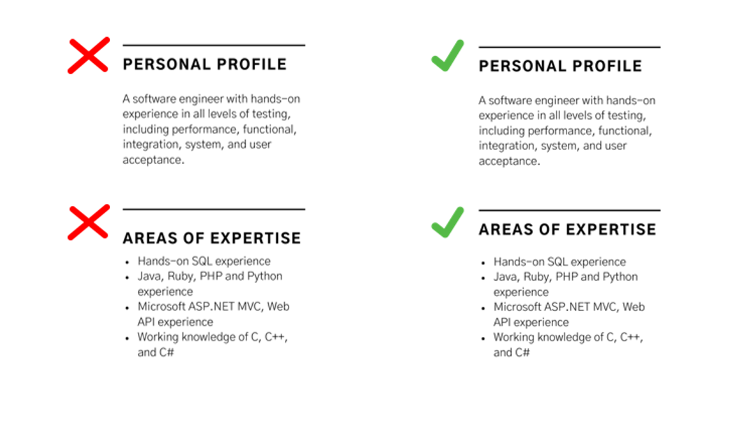 5. AlignmentIf you've chosen to use text boxes, headings or shapes on your CV, make sure that they align to follow one smooth margin. All your headings and text should start at the same point on the page and there should be no indents. This helps to guide the reader down the page.  6. IconsIf you choose to use icons on your CV, make sure that you have removed the background if it doesn't match the rest of your CV. Pasting icons into your document with a small white square outline can look messy and unprofessional. You should also avoid using an images that are pixelated or appear with a watermark.  7. PictureAdding an image of yourself on your CV isn't necessary, but sometimes using an image can compliment your design and reduce empty space. If you are going to include a picture of yourself, make sure it is one where you are dressed smartly. Similar to icons, make sure that this image hasn't got a white square around it and doesn't appear pixelated. One more top tip: The style of CV you design should reflect the nature of the organisation or role you are applying for. For example, if you are applying to be a marketing assistant at a fun food brand, your CV should reflect that by featuring bright colours and cool fonts. If you are applying for a more corporate role, your CV should use more muted colours and a clear, plain font.
I always look at any documents that may be featured on the website of the organisation I am applying to and create a design similar to that. If they don't have anything on their website, I try to imagine the type of document they would produce based on their branding. You can get a good idea of how an organisation might design their reports and brochures by looking at the style of their social media posts too. The key to creating an eye catching, effective CV is to make the process of reading it easy and straightforward for someone who has never met you before and only has this to understand who you are and what you want. |
AuthorThe Blue Graduate is a career and wellbeing advice and guidance blog for students and graduates experiencing post-uni 'blues'. Archives
September 2020
Categories
All
|

 RSS Feed
